Product UI & interaction · Stem
STEM.FM
Room for the music. Clarity in the interface.
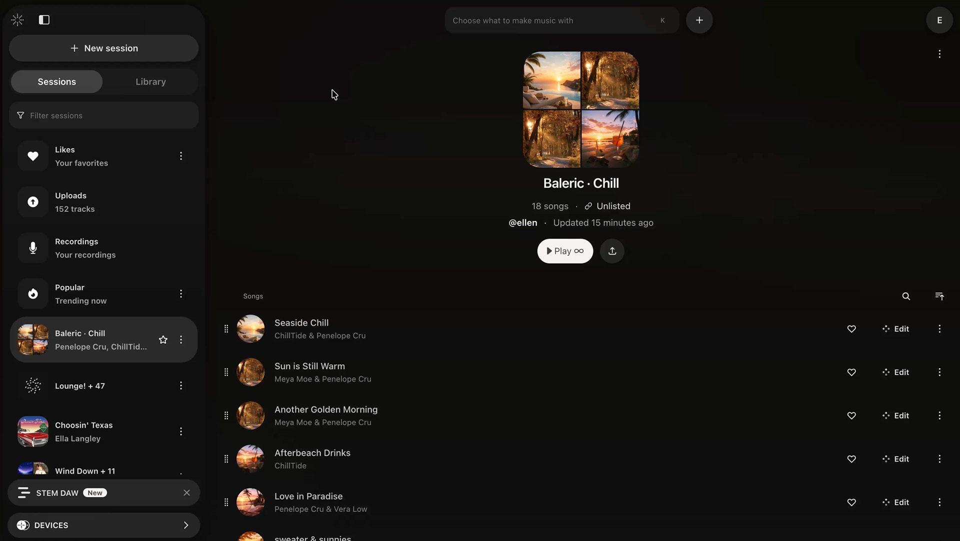
The work
Responsive, interaction-heavy product experiences across desktop and mobile. My work focused on navigation, hierarchy and feedback, keeping the track list central while making secondary controls easy to find.
- My contribution
- Frontend development & UI refinement
- Focus
- Responsive behaviour, hierarchy & interaction
Responsive navigation
On desktop, opening the sidebar shifts the main content alongside it. On mobile, it opens as an overlay, keeping the underlying layout in place.
Export across screens
The export interaction adapts across desktop and mobile.
Scroll & hierarchy
The session header contracts as users scroll into the track list, giving tracks more space while keeping session context and key actions accessible.
Small interactions, clear feedback
Playback transitions and “Link copied” feedback make changes clear without adding persistent clutter to the interface.
Managing complexity through hierarchy
This UX brings together search, session navigation, track information and actions. I refined the hierarchy to keep the track list central, with navigation and secondary controls easy to find without competing for attention.