Agentic programming · Self-directed wedding concept
Wedding concept
An English garden, translated into a digital invitation.
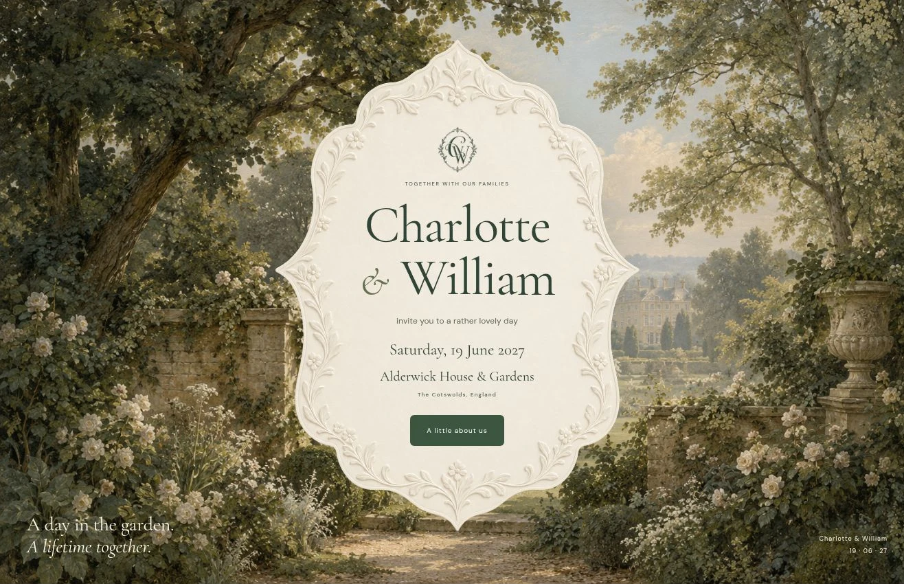
The project
A self-directed wedding website concept exploring how expressive visual design can become a working guest experience. I directed the concept, palette, typography and visual refinements, using coding agents to develop the implementation. The result brings the character of printed stationery into a responsive website, with a story, illustrated programme and practical guest tools.
- Context
- Self-directed wedding concept
- Built with
- React · TypeScript · Vinext · Cloudflare D1
- My contribution
- Art direction, interaction decisions & iterative review
- Status
- Published concept · Further refinement ongoing
The concept: a day in the garden
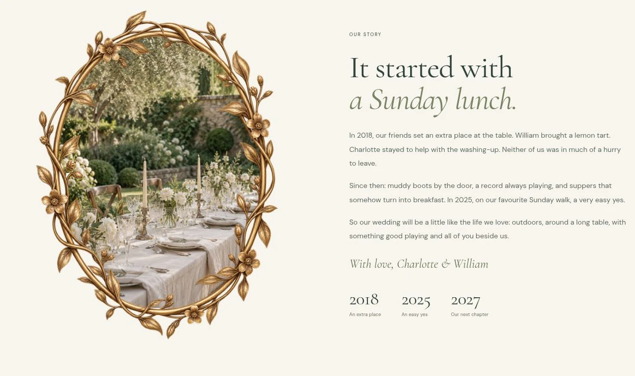
I wanted the website to feel like an invitation to an intimate country-house celebration. A painted garden sets the scene; sculpted paper, a botanical monogram and an oval gilded frame give it the tactile character of stationery. Cormorant’s expressive serif and italic forms carry the romantic tone, while DM Sans keeps navigation and practical details clear. The story and copy connect the visual direction to a shared love of gardens, long lunches and records.
A palette with a purpose
Forest green gives headings and actions a consistent anchor. Warm ivory and paper tones soften the page, while sage separates sections without a hard visual break. Butter and muted gold echo the garden light and decorative frames. Repeating these colours across imagery, typography and controls makes the experience feel connected.
- Forest#2B4437
Headings & visual anchor
- Ivory#F7F5ED
Main page background
- Sage#DCE3D3
Soft section contrast
- Butter#E7DBBA
Warm decorative tone
- Paper#F7F2E4
Stationery-inspired warmth
Developing the design
The design developed through focused visual reviews: judging the composition, identifying what felt wrong, then giving the agent a specific change to make. The main challenge was keeping the decorative character consistent while making the content work at different screen sizes.
Build a coherent visual language
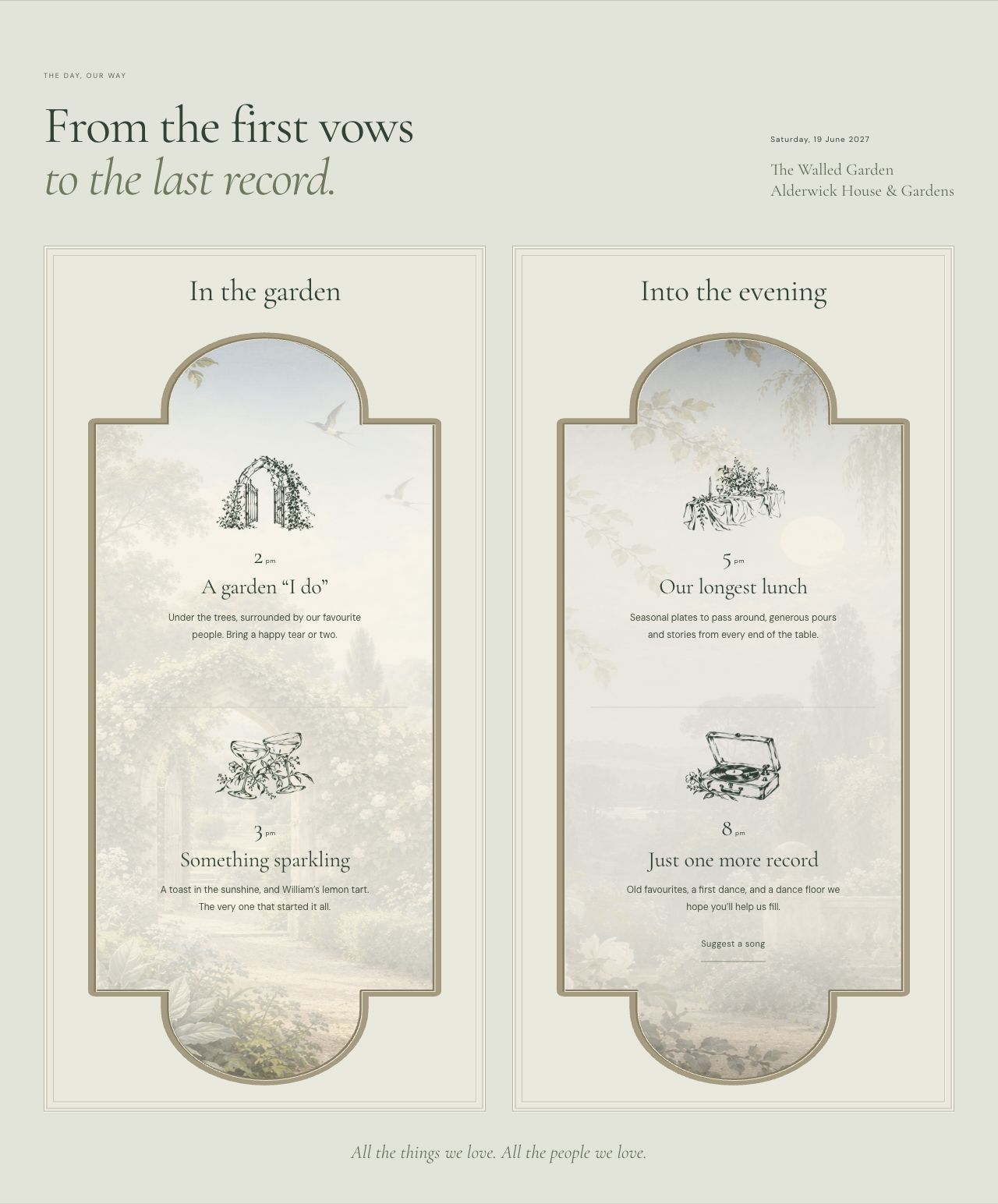
Garden paintings, botanical details and shaped frames carry the same atmosphere through the invitation, story and programme. Generated assets were directed around a shared palette and material feel.
Refine proportions on mobile
Mobile review exposed stretched decorative panels and closing text that became too small. The refinements preserve the stationery artwork’s proportions and scale the type within its container, balancing readable copy with the space inside the frame.
Directing an agentic build
I used coding agents to translate the visual brief into React and TypeScript components, develop interactions and apply successive refinements. My role was to set the direction, evaluate the output and turn broad feedback into concrete decisions about hierarchy, proportion, typography and behaviour. The process connects design judgement with implementation: each iteration has a specific problem to resolve and a result to review.
Define the direction
Establish the garden concept, visual references, colour relationships and the information guests need.
Implement and inspect
Use agents to build the interface and interactions, then review the rendered result against the intended design.
Refine with specific feedback
Adjust the details that affect the experience: artwork proportions, type scale, spacing and navigation across screen sizes.
The working concept & next steps
The published concept includes a countdown, calendar download, mobile navigation, expandable FAQs and a song-request flow backed by D1. The RSVP dialog covers attendance, guest details and a review step. The couple, venue, story and imagery are illustrative. Further refinement focuses on validating the complete guest journey before using it for a real event. Alongside my other wedding project, this explores how a different visual brief can lead to a distinct design system and experience.